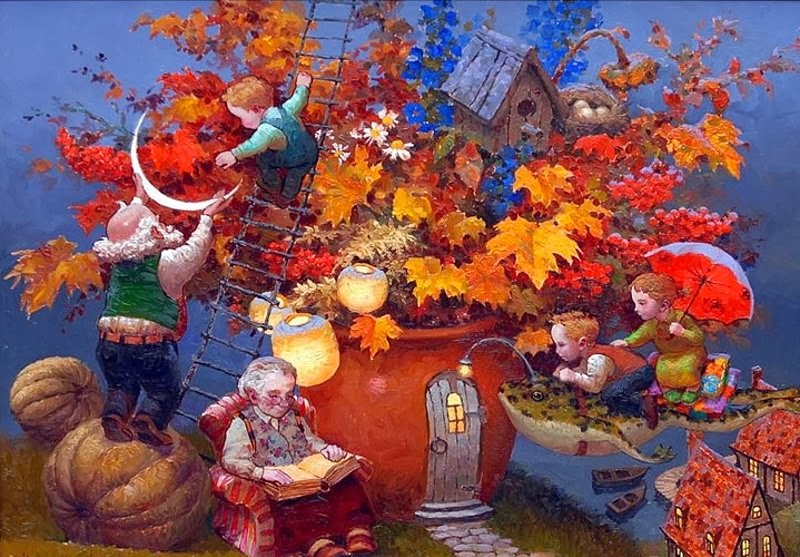
The principles of design help you to carefully plan and organize the elements of art so that you will hold interest and command attention. This is sometimes referred to as visual impact.
In any work of art there is a thought process for the arrangement and use of the elements of design. The artist who works with the principles of good composition will create a more interesting piece of art it will be arranged to show a pleasing rhythm and movement. The center of interest will be strong and the viewers will not look away, instead, they will be drawn into the work.
A good knowledge of composition is essential in producing good artwork.
VISUAL ARTS
viernes, 8 de noviembre de 2013
Principles of Art and Design: UNITY AND VARIETY
Unity is described as a sense of wholeness or oneness that is present when all parts of an art form work together. The concern if for the total form rather than individuals parts.
Variety is contrast of colour, different shapes or variations of lines or textures can create some interest and excitement.
Principles of Art and Design: PROPORTION
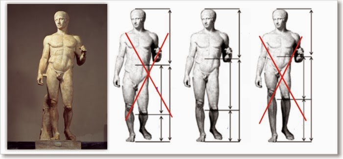
Proportion is a principle of art that describes the size, location or amount of one element to another (or to the whole) in a work.
It has a great deal to do with the overall harmony of an individual piece.
Proportion also may be the relationship of the size of an artistic artifact (painting, sculpture, design, etc.) with the human being. That is the Scale.
Principles of Art and Design: RHYTHM
Rhythm result from the organized repetition of an element or elements in a work of art.
Three methods of creating rhythm:
1. Repetition
2. Alternation
3. Progression
Principles of Art and Design: EMPHASIS
Emphasis is the part of the design that catches the viewer's attention. Usually the artist will make one area stand out by contrasting it with other areas. The area could be different in size, colour, texture, shape, etc.
Principles of Art and Design: BALANCE
Balance is the distribution of the visual weight of objects, colours, textures, and space. The elements should be balanced to make a design feel stable… or not.
2. Asymmetrical balance often conveys a sense of movement since the elements of the composition are unbalanced.
- Symmetrical balance conveys a sense of stability.
2. Asymmetrical balance often conveys a sense of movement since the elements of the composition are unbalanced.
Elements of Visual Language: TEXTURE
The surface quality of an object that we sense through touch.
All objects have a physical texture. Artists can also convey texture visually in two dimensions.
- In a two-dimensional work of art, texture gives a visual sense of how an object depicted would feel in real life if touched: hard, soft, rough, smooth, hairy, leathery, sharp, etc. Artists use color, line, and shading to imply textures.
- In three-dimensional works, artists use actual texture to add a tactile quality to the work.
Suscribirse a:
Comentarios (Atom)


.jpg)


.jpg)


.jpg)


